Sustainable fashion concept

Green Earth

This project began with a question: how do you design for ease, not just function?

Overview

ClientGreen Earth
Tools Figma
My Role
Product Designer
Timeframe
June 2025
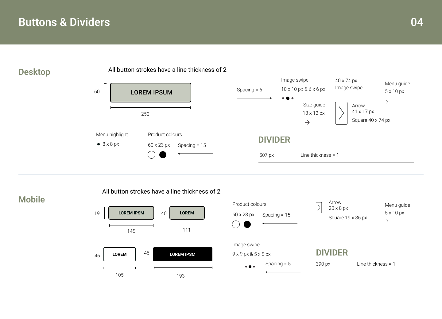
Green Earth is a sustainable fashion brand that champions ethical production, organic materials and timeless style.

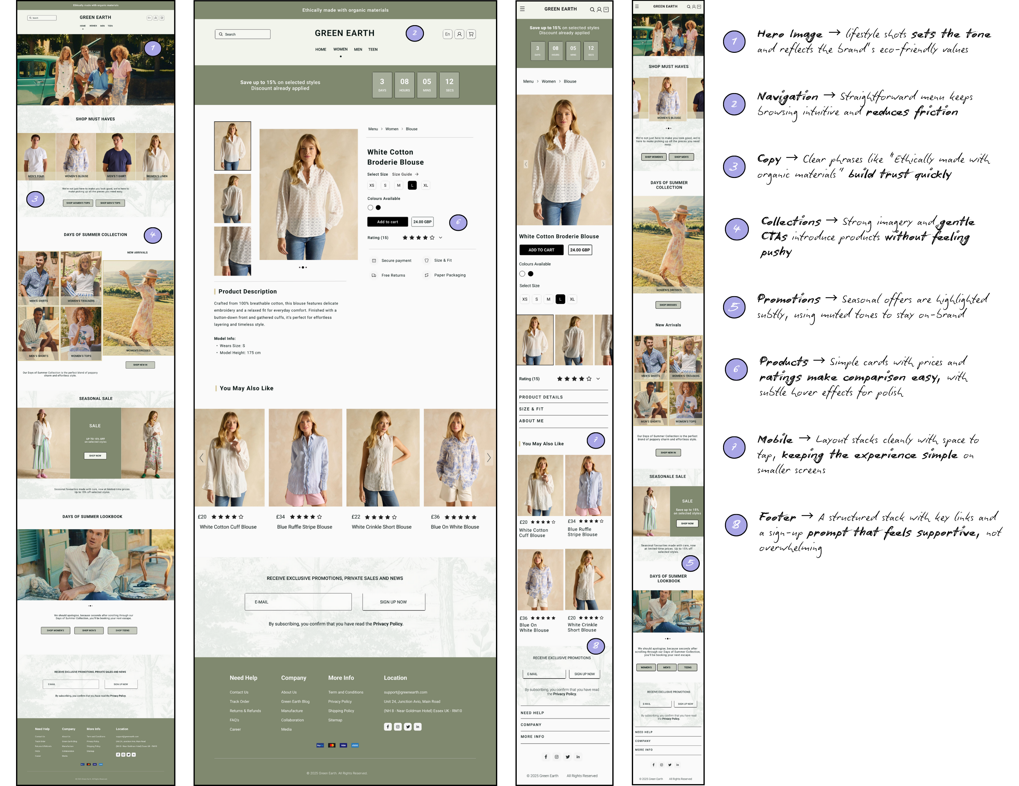
When I took on this project, the goal wasn't to make a site that looked good. It needed to feel purposeful and intuitive and instantly communicate what the brand stood for. I wanted users to land on the homepage and immediately feel like "This brand gets me."

The task was to design a visual identity and shopping experience that felt calm, grounded and hones, just like the clothes Green Earth makes. Every design decision I made had to reflect those core values while keeping the user experience smooth and engaging.

Challenge

Green Earth has a strong mission but needed a digital space that captured it. The challenge was translating ideas like sustainability, simplicity and intentional living into a design that didn't feel overly curated or "salesy." I had to strike a balance between clean design and emotional warmth, making sure users feel something as they navigated the site, not just scanned through it.

Chapter One

Mood Board: Shaping the Direction

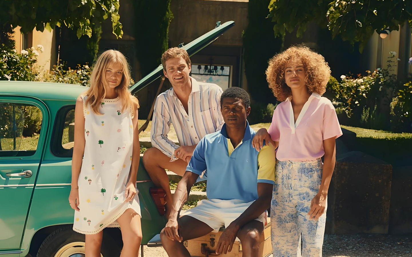
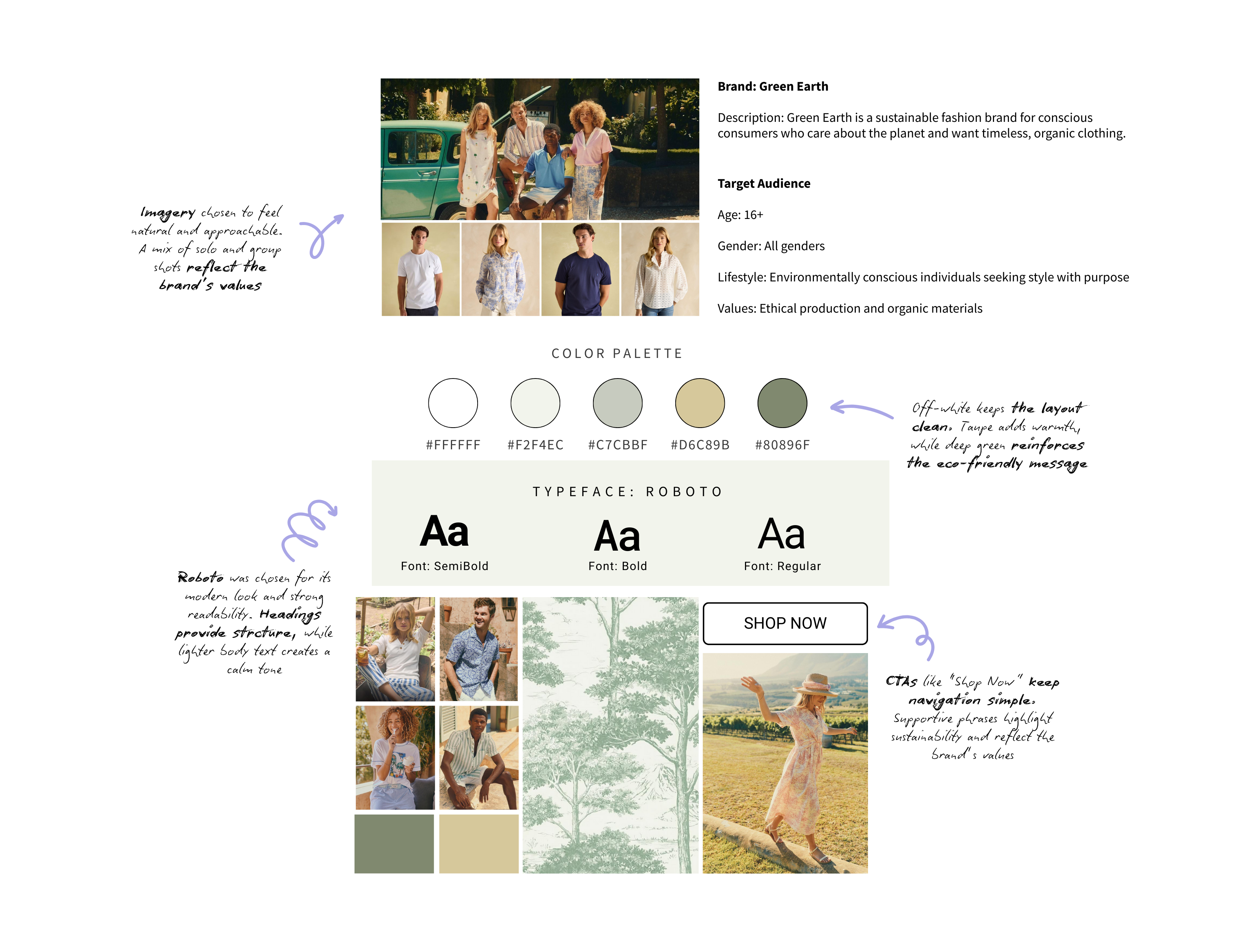
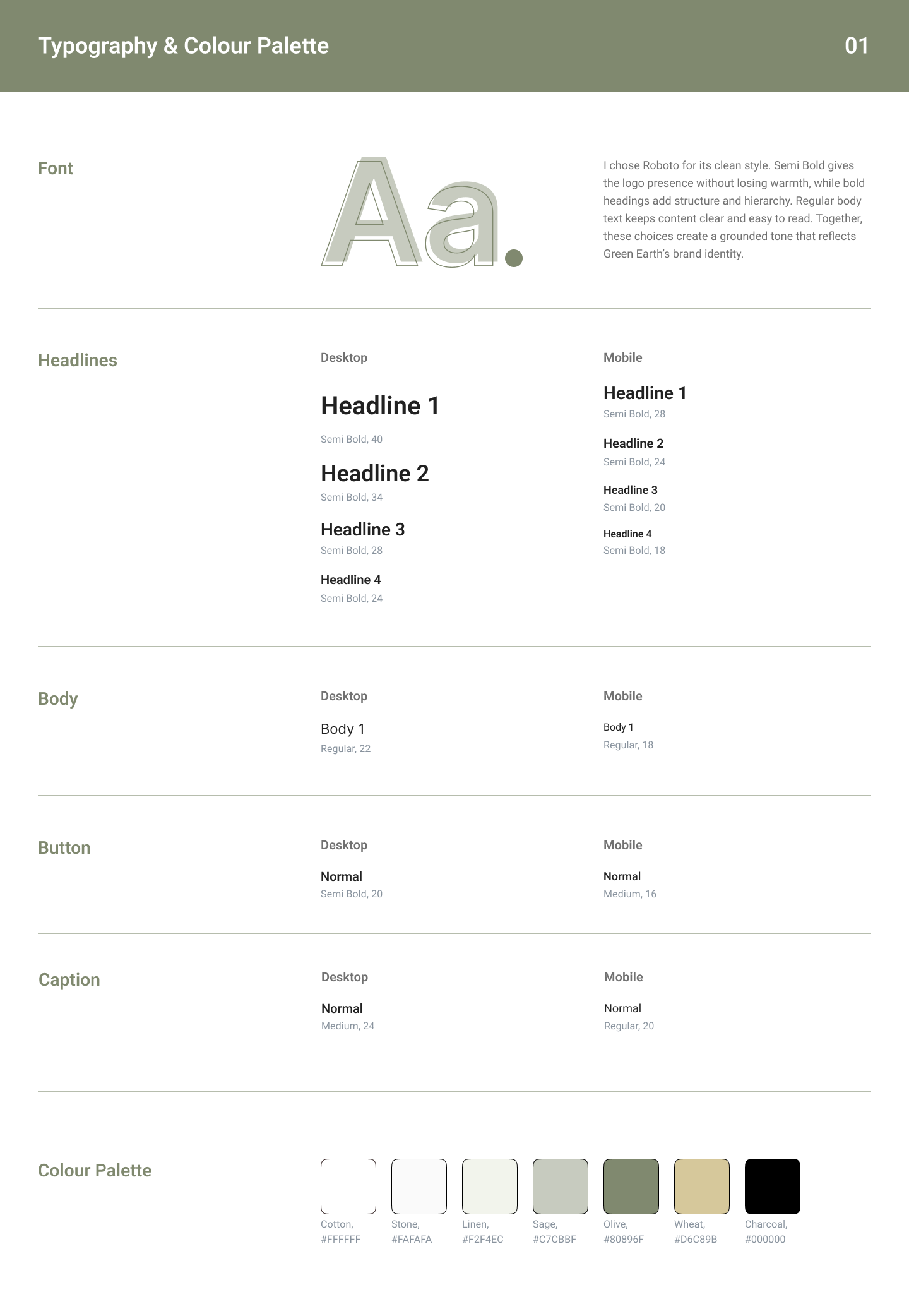
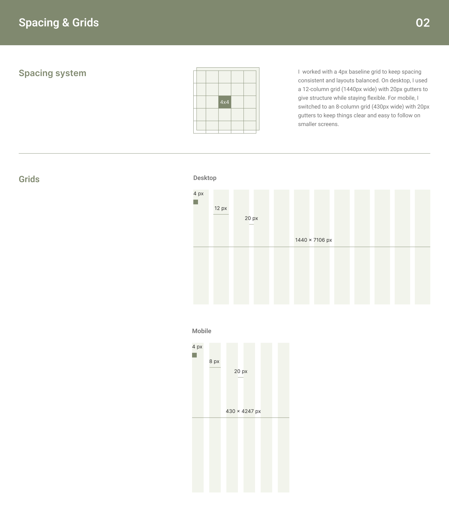
To ground the visual language, I created a mood board that guided all choices across layout, imagery, colour and tone. My goal was to make every element feel connected, creating a journey that aligned with how Green Earth customers see the world, through a lens of care and clarity.

When someone lands on the Green Earth site, I want them to feel like they've entered a calm, welcoming space. A place that reflects who they care about. Through thoughtful colour choices, intentional typography and emotionally resonant imagery, this design speaks to more than just fashion, it tells a story of conscious living and everyday ease.

The final result is a digital experience that's grounded, human and aligned with the brand's mission, from the first scroll to the final click.

Chapter Two

User Flow: Mapping the Experience

To support the overall structure of the site, I created a detailed user flow focused on the end-to-end journey, from landing on the homepage through to checkout and account management. This helped me understand the user's mindset at each step and map out the necessary screens, actions and potential outcomes. It became a key reference for anticipating edge cases, ensuring key decisions like login, product discover and adding to cart felt uninterrupted.


Chapter Three

Wireframes: Early Decisions with Purpose

Before colour, imagery or even copy, I start by shaping the flow. Wireframes, especially at high fidelity are where functionality and emotion begin to merge. For Green Earth, the aim at this stage was to build a calm and intuitive shopping experience that reflected the brand's values from the inside out. The wireframe had to feel purposeful and welcoming, even in its most stripped-back form. This wasn't just about where things go, it was about how users move, pause and feel through the journey.


The wireframe stage wasn't just about technical layout. It was about laying the groundwork for a thoughtful, emotionally resonant experience. Every spacing rule, alignment choice and structural decision was made with the end user in mind. It's about giving shape to the values behind Green Earth, even before the colours and images bring it to life.

Chapter Four

Design System: Clarity Through Consistency

Design systems often get reduced to grids, colour codes and font sizes. But for me, this one was about something deeper, creating a sense of calm consistency across every part of the experience. Green Earth needed a system that wasn't just functional, but emotionally aligned with the brand's values: simplicity, integrity and ease. Every element was designed not just to look good, but feel right and to support the user quietly, without ever getting in the way.


The goal of this design was coherence. I wanted every element to feel like it belonged, not just visually, but emotionally. From the colour choices to the icon sizing, everything was build to support a calm, confident experience. One that doesn't just work well, but feels good to use.

Chapter Five

Final Screens: Bringing the Framework to Life

The final desktop and mobile screens were build directly from the foundation laid in the wireframes, user flow and design system. By this stage, the structure was already in place, it was just about bringing it to life in a way that felt true to the brand.


Chapter Six

Reflection: A Process with Purpose

Early Alignment

One of the most rewarding parts of this project was starting with the mood board. It gave me a strong sense of direction early on, not just visually, but emotionally too. Having that reference made it easier to make design choices that felt aligned with the brand. From there, building the wireframes came naturally. I had a clear foundation to work from, which made the transition into the final design feel confident and purposeful.


A Balancing Act

Finding the right colour palate took more time than I expected. I wanted tones that supported the imagery, not colours that would compete with it or feel too forced. I was a careful balancing act: keeping things soft and earthy without everything blending into the background.

Another challenge was making sure desktop and mobile users had an equally thoughtful experience. It wasn't just about responsive layout, it was about making sure both platforms felt complete, ont like one was a simplified version of the other.


Final Reflections

The project was a reminder that early thinking really does shape everything. Taking the time to define the visual tone and user journey up front made each decision more intentional later on. It also deepened my approach to responsive design, not just resizing things, but thinking about how people interact differently across screes and how to meet them where they are without compromising the experience.