Competitor Analysis
I carried out a competitor analysis to understand how existing platforms approach travel
booking.
This wasn't about copying features but about identifying strengths I could learn from and
weaknesses
I could improve on. Looking at both global platforms and niche providers gave me a clear picture
of
where Arctic Travels could stand out.
Booking.com offers a one-stop shop for global travel with flexible booking
options,
competitive pricing, and a loyalty system that rewards returning users.
Strengths:
- Genius loyalty program rewards returning users with discounts and perks
- “Book now, pay later” and free cancellation on many properties
- 24/7 multilingual customer service
- User reviews and translation features improve global trust
Weaknesses:
- Hidden fees sometimes revealed late in the booking flow
- Overcrowded / overwhelming UI on certain steps
- Limited storytelling; experience can feel purely transactional
- Visual balance issues on pages with large white spaces
Expedia is an all-in-one travel booking with competitive pricing, bundled deals
and
the One Key
Rewards Program,
it caters to various travel styles and budgets
Strengths:
- Extensive bundling options (flights, hotels, cars, activities) in one platform
- Smart filters and virtual travel assistant for simplified planning
- App and website support group booking and multi-user coordination
- Reviews and price drop tracking increase trust and value
Weaknesses:
- Hidden fees not always disclose upfront in pricing breakdown
- Landing pages can feel cluttered and overwhelming to some users
- Confusing mobile layout (as reported by some case studies)
- Limited ethical travel or sustainability-focused filters
Epic Polar is designed for niched traveller seeking meaningful and ethical
adventures in the
world's
most remote destinations.
Strengths:
- Clear brand identity centered on purpose-driver travel
- Simple UI and intuitive layout with minimal menus and clear navigation
- Emphasis on expert insights (vs. mass-market recommendations)
- Additional experience enhance user value (e.g. wildlife tours)
Weaknesses:
- Some pages are text-heavy, which could overwhelm users
- Lack of a hover feature on travel cards (limits interaction clarity)
- No text on hero image/banner, which weakens initial user engagement
- No search bar available for flexible exploration (e.g. typing destinations)
What became clear was that large providers like Booking.com and Expedia are strong on
functionality
and choice but often at the cost of clarity and inspiration. Niche platforms like Epic Polar
offer
personality and purpose but struggle with scale and usability. This gap highlighted an
opportunity
for Arctic Travels to combine the best of both worlds: a platform that is functional and easy to
use, while also delivering a more engaging experience.
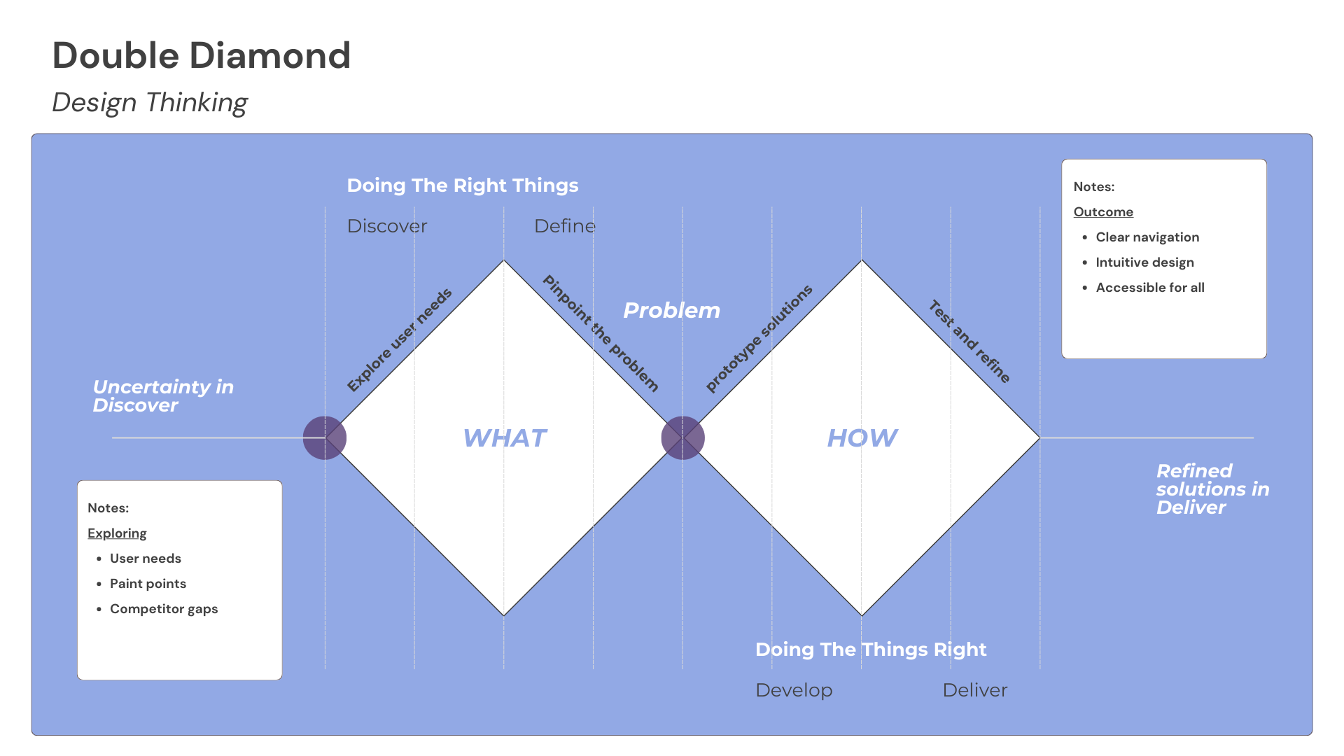
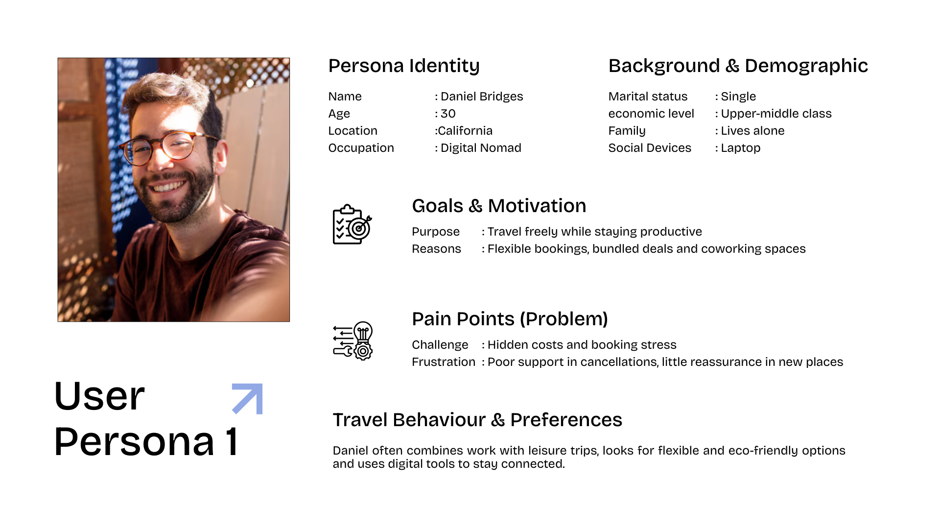
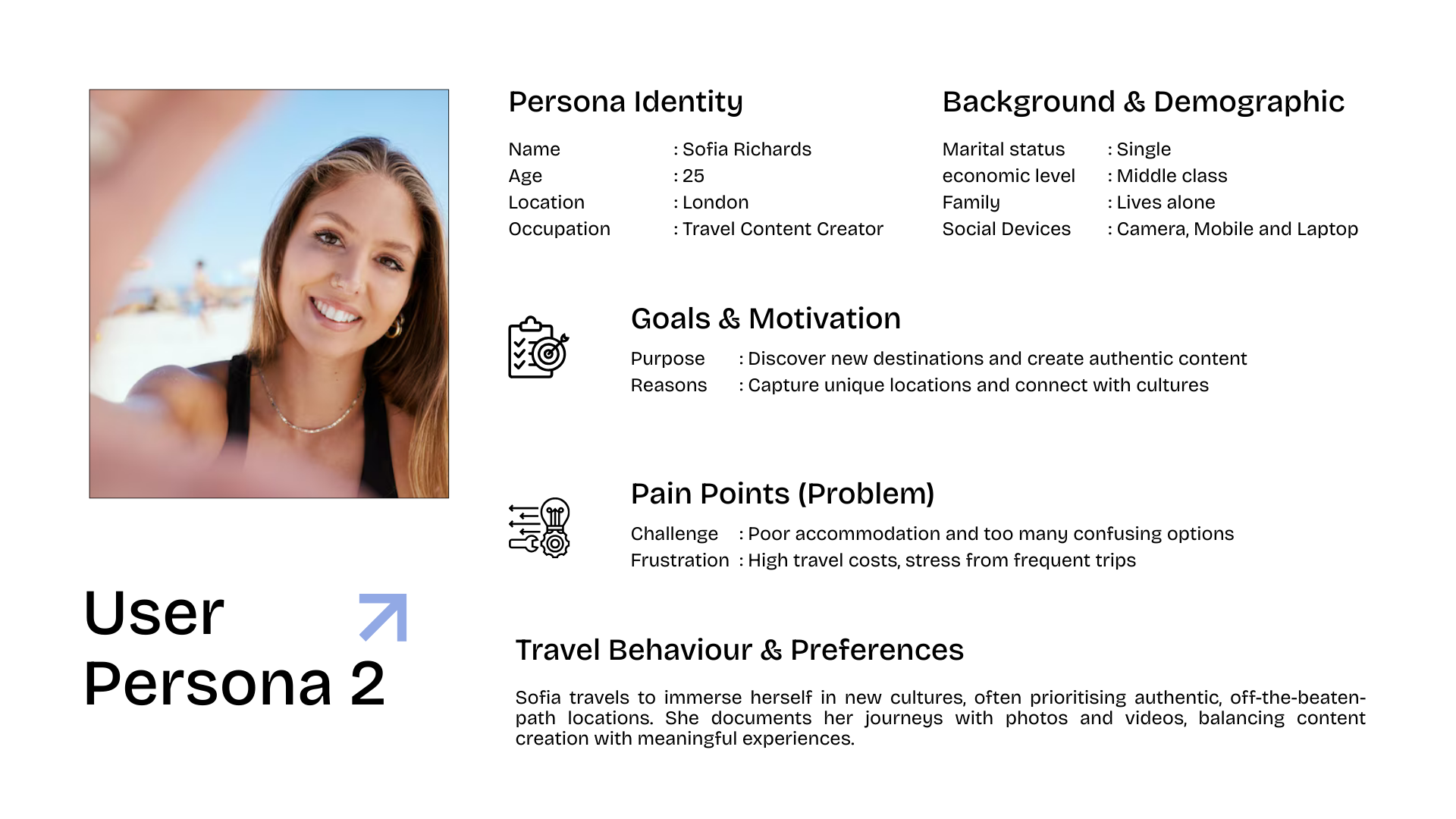
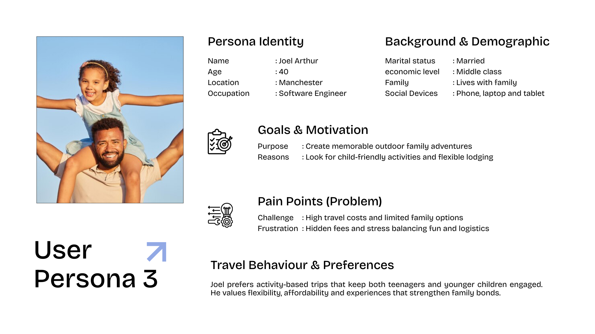
User Persona
Before sketches, systems and screen layouts. I needed to understand who I was designing for and
why.
This stage was all about people. Planning a holiday might sound exciting but when you dig into
it,
the reality often involves messy logistics, tight budgets and competing priorities. My goal was
to
step into those real experiences and design with empathy.
From these insights, I created a set of personas that captured the different types of travellers
I
was designing for. Each persona highlighted distinct needs, motivations and frustrations, which
helped me make design decisions that felt grounded and purposeful.